Logo System
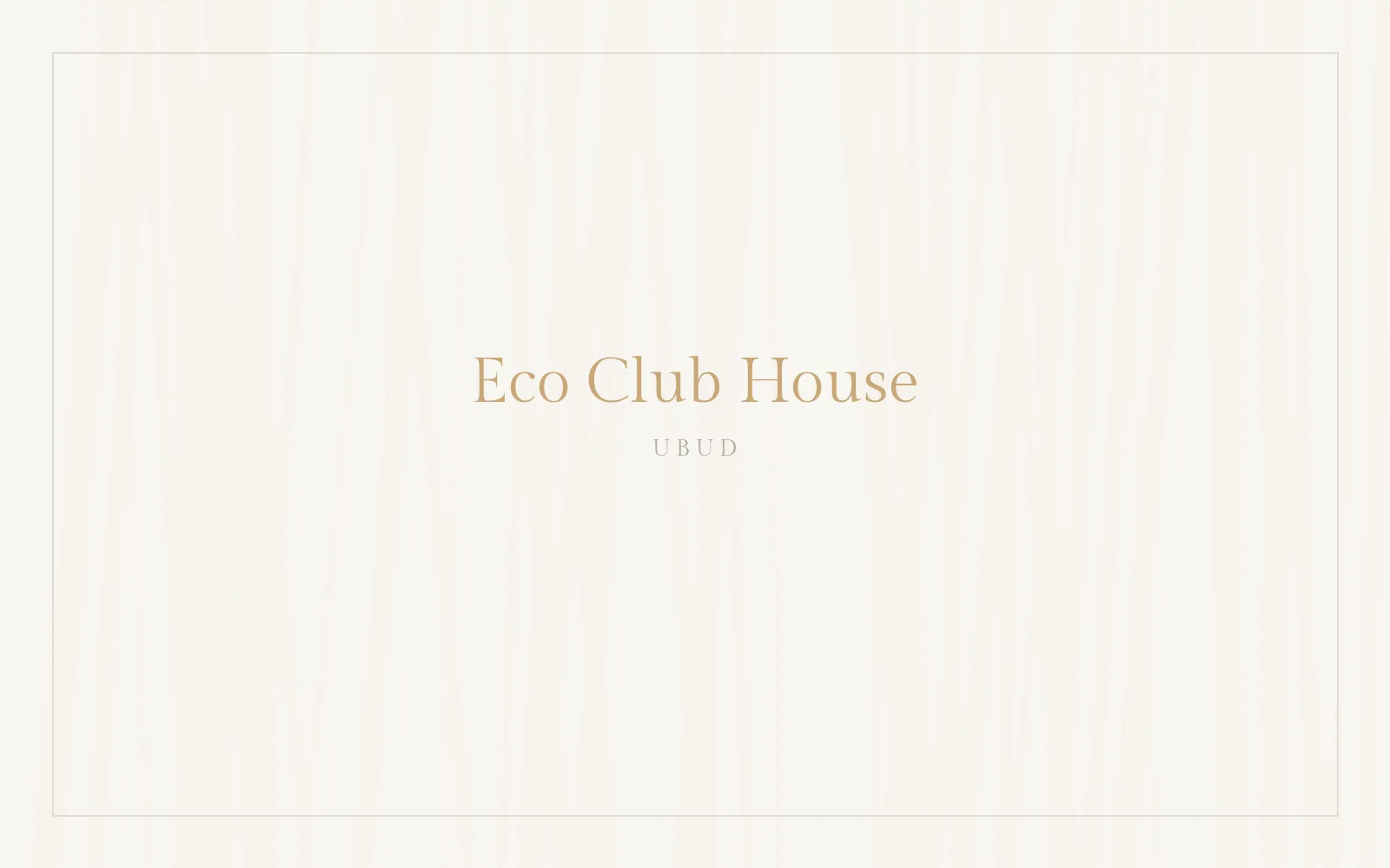
Primary typeface: Gilda Display — delicate hotel serif, thin and airy. Three logo forms cover every use case. PNG files with transparent background — click to download.


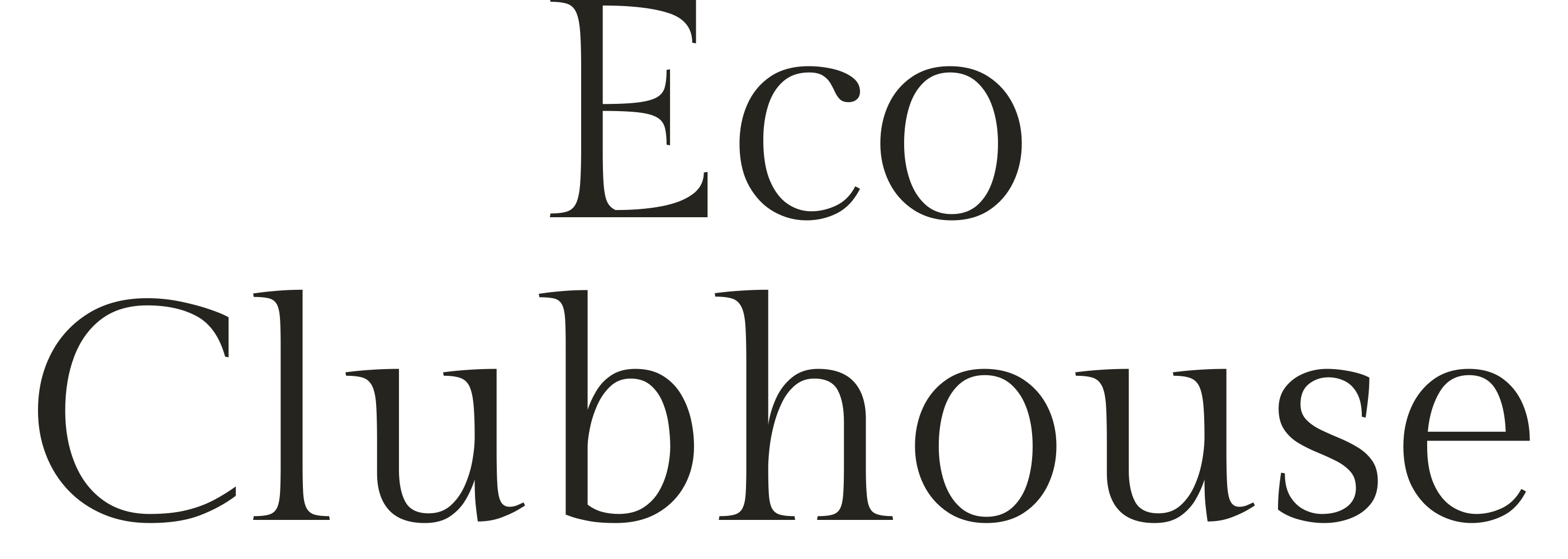
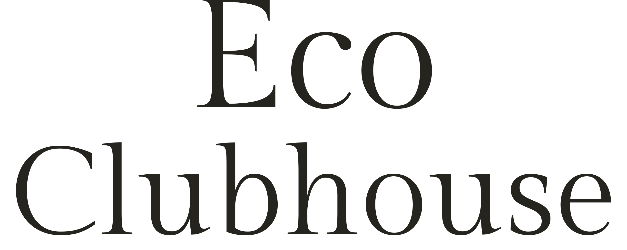
Two-line lockup · «Eco / Clubhouse»
No circle, balanced weight — three variants. Hi-res transparent PNG (ink + white) behind each.

Downloads: primary ink · primary white · stacked ink · stacked white · monogram ink · monogram white · monogram brass
Hi-res pack for designers (transparent PNG, 3000–5100 px): primary ink · primary white · primary brass · stacked ink · stacked white · stacked brass · monogram ink · monogram white · monogram brass · wordmark+Ubud ink · wordmark+Ubud white · wordmark+Ubud teak (embroidery)
CNC & wood engraving · monogram «Eco» (pure black #000, 9000 px = 76 cm at 300 dpi; SVG — vector outlines, no font needed): PNG transparent · PNG on white · SVG vector (for CNC)
Clear Space & Minimum Sizes
- Clear space around the wordmark — at least the height of the letter «E» on every side
- Minimum width: print 40 mm · screen 180 px · embroidery 80 mm (use monogram below that)
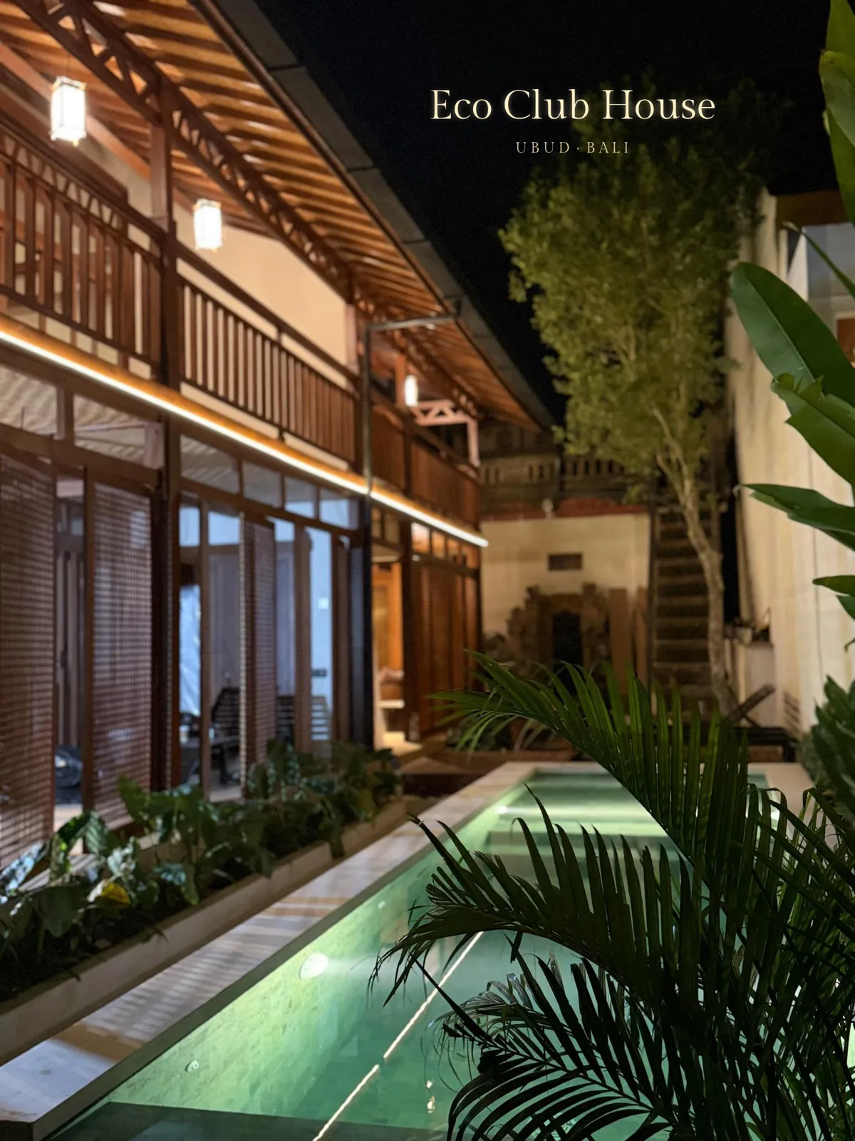
- On photos — place only on calm areas; white or tone-on-tone version
Colour Palette
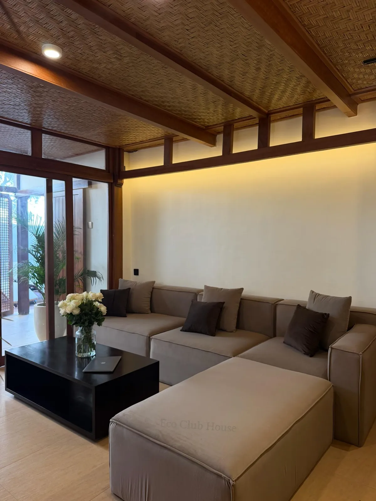
Taken from the house itself: teak wood, woven ceilings, travertine, warm brass light, garden greens.
Typography
Usage Rules
- Ink on cream · white on dark wood & night photos · brass for accents
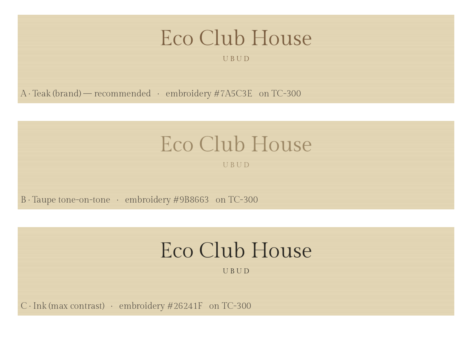
- Embroidery: tone-on-tone thread on textiles, brass thread on dark
- Keep the wordmark horizontal, tracking as designed
- No stretching, condensing, outlines or shadows
- No bright colours, gradients, busy photo areas
- No other typefaces in the logo lockup
Applications
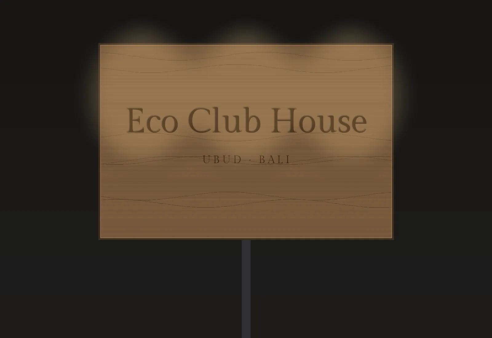
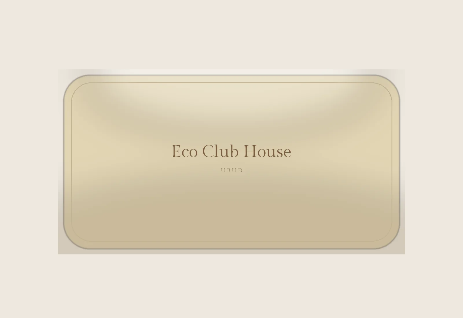
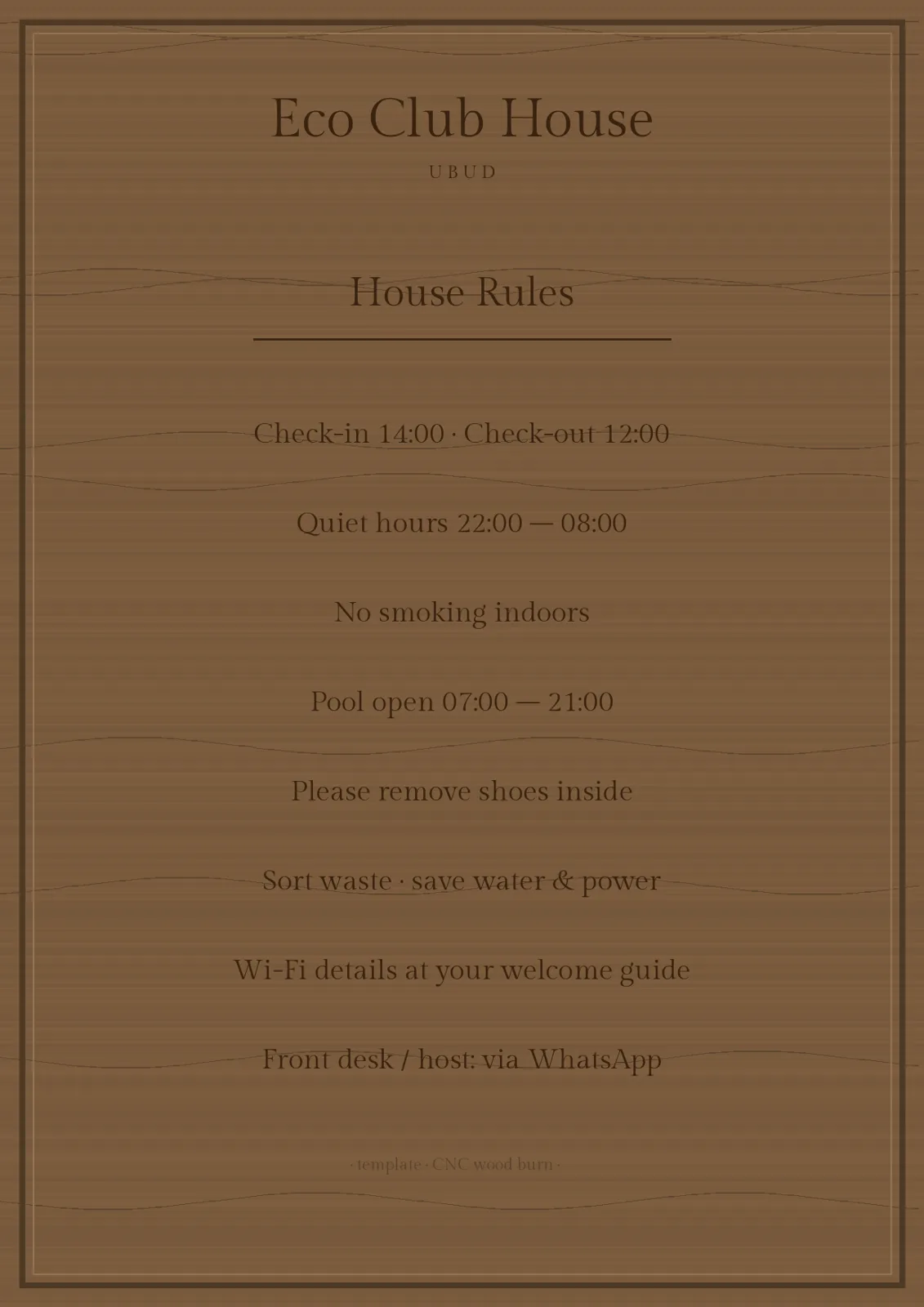
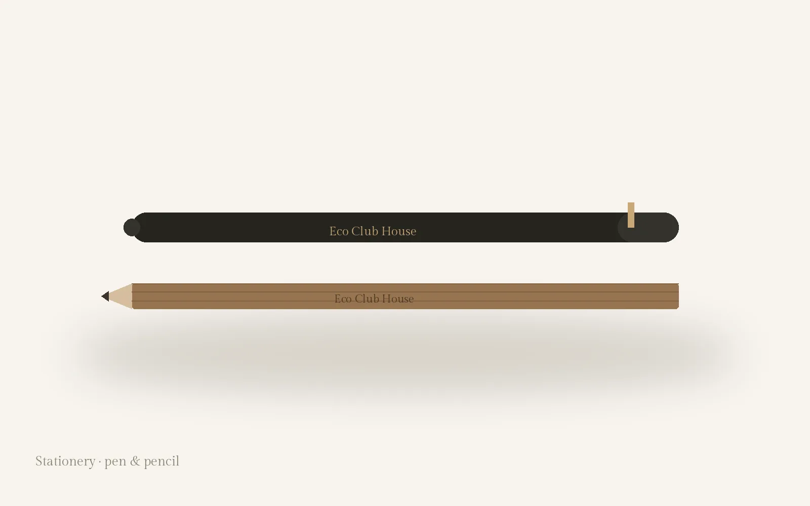
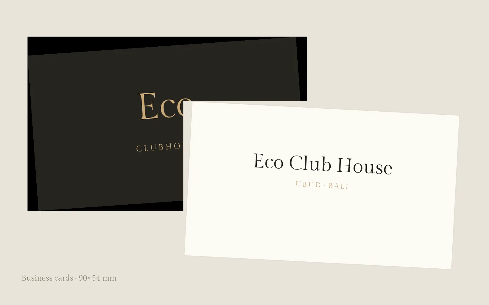
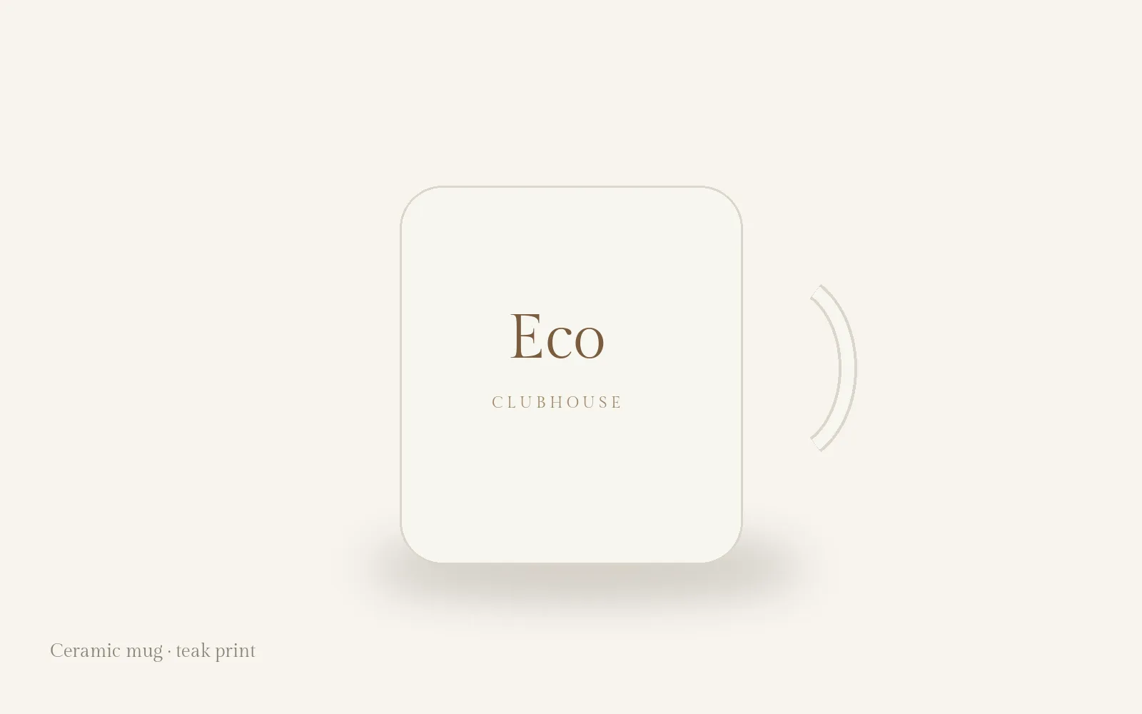
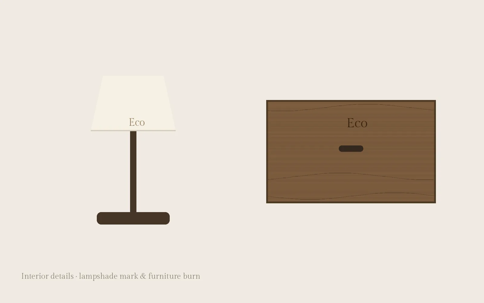
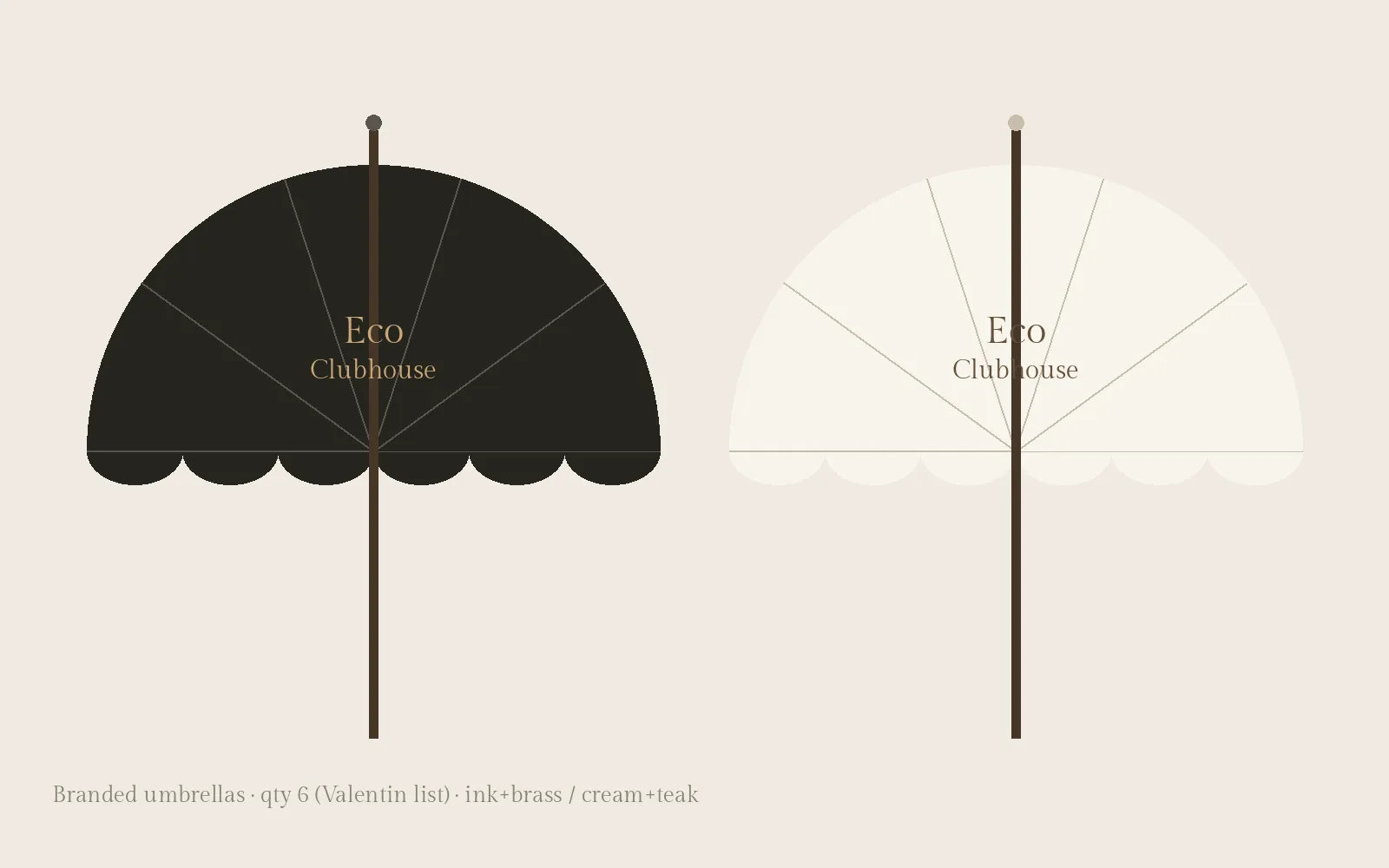
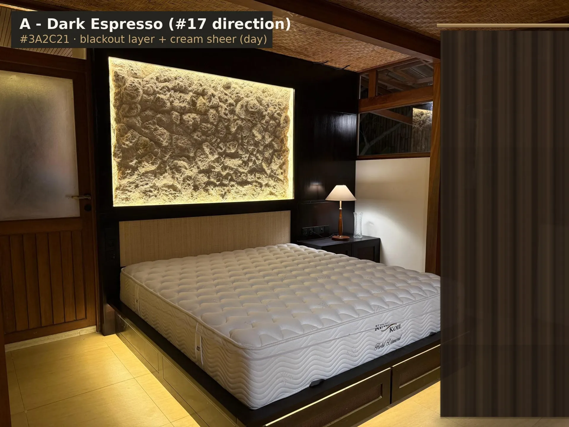
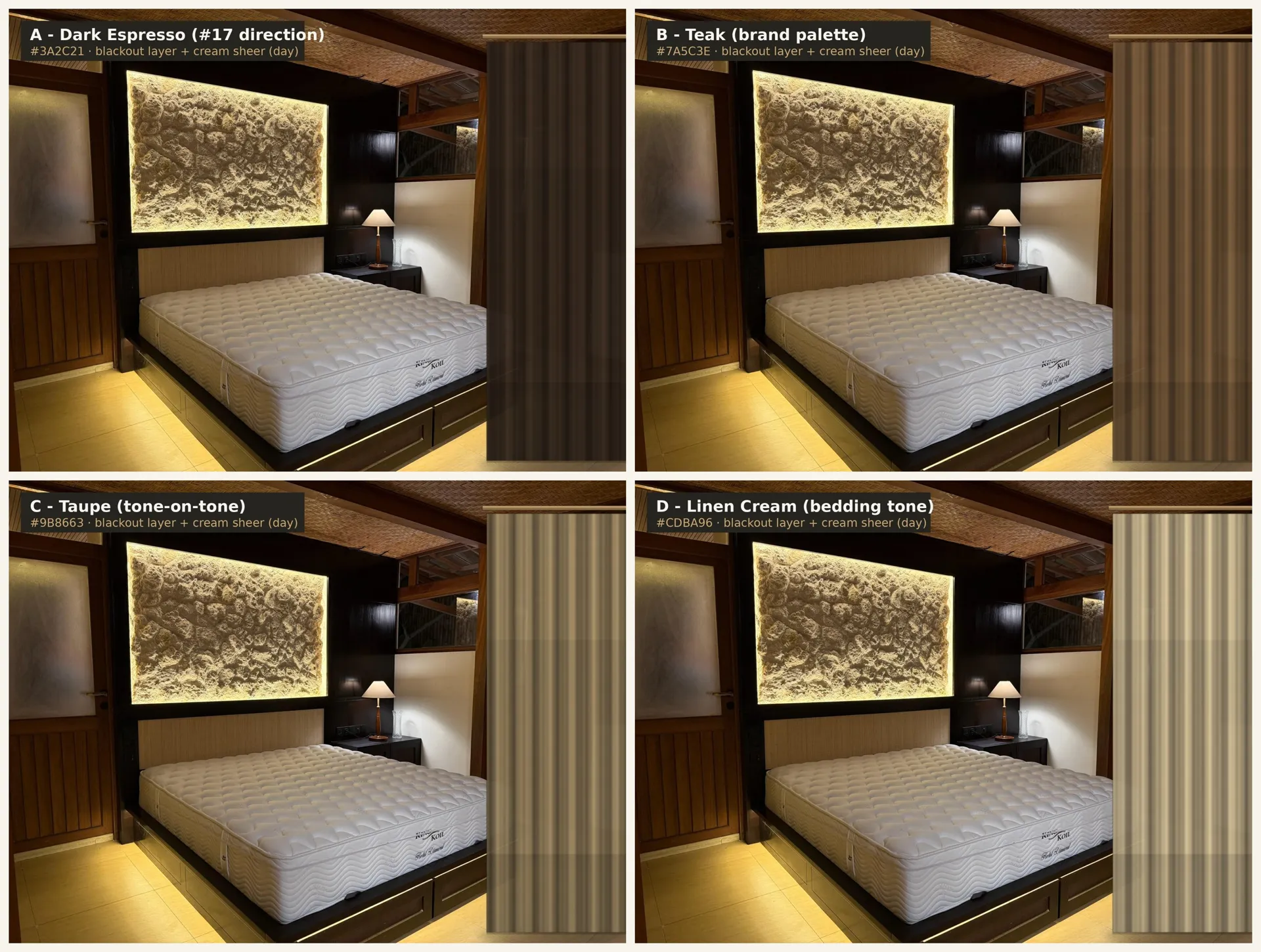
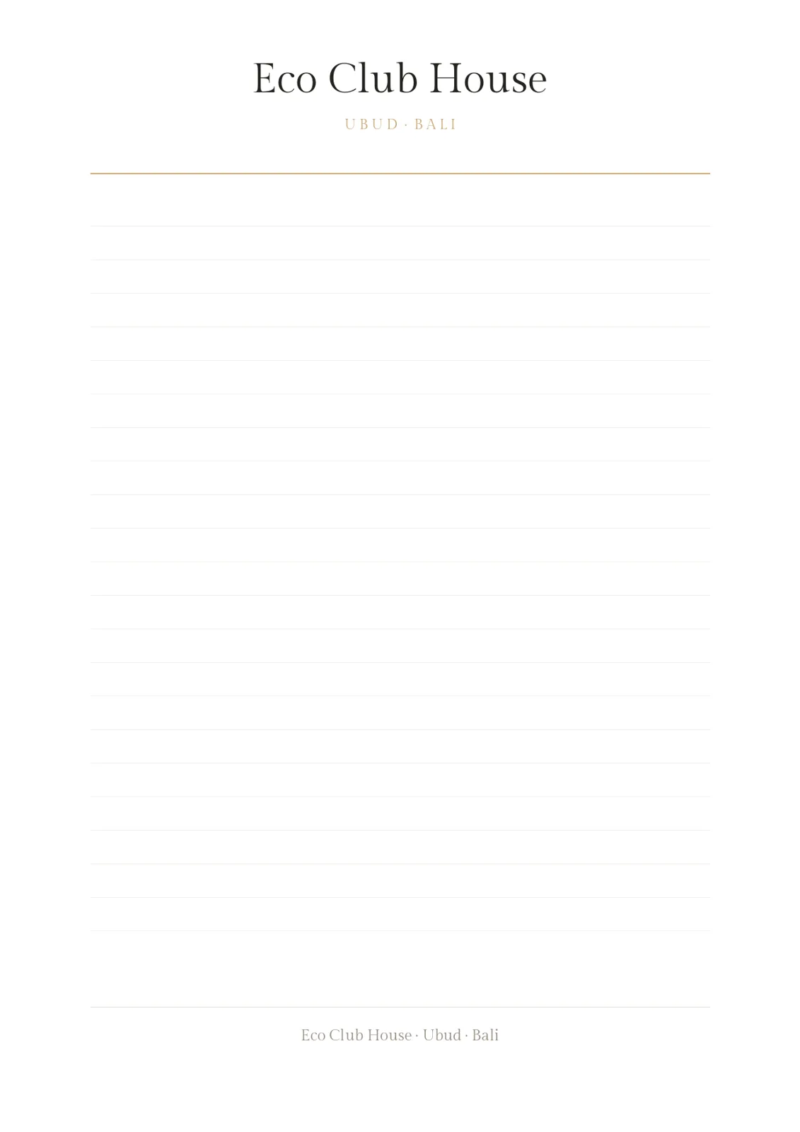
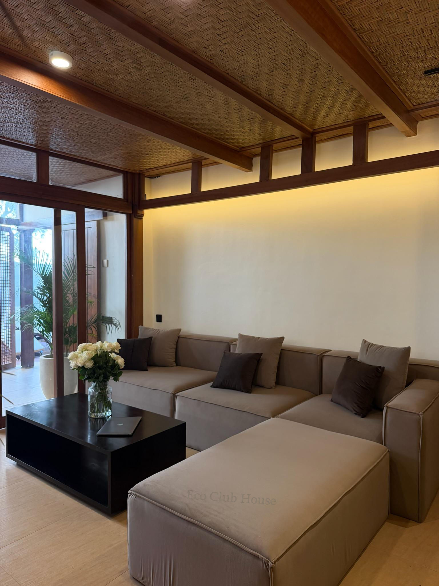
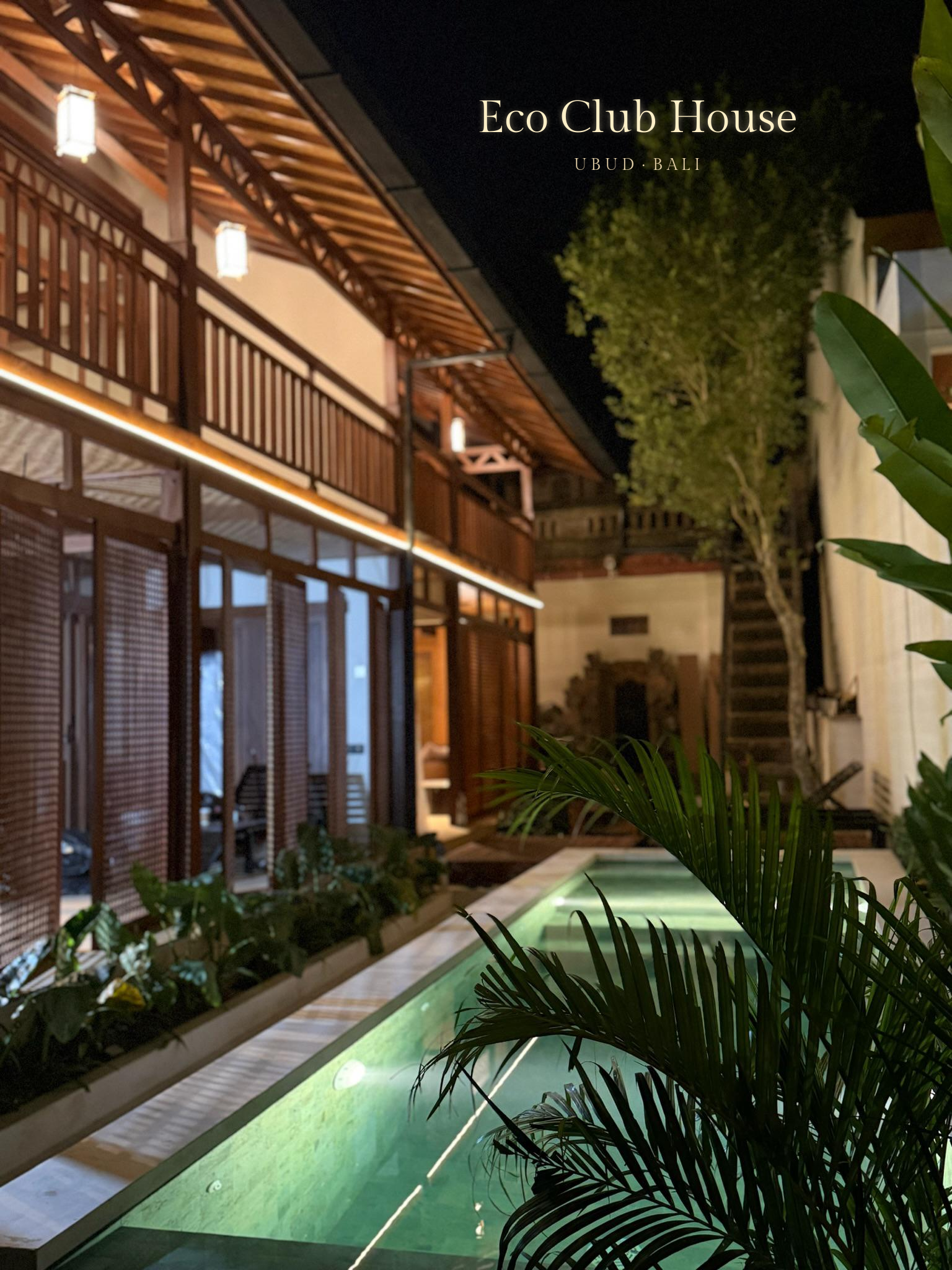
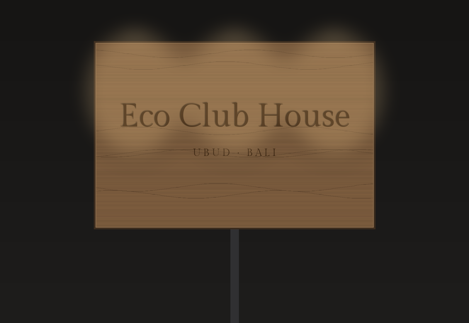
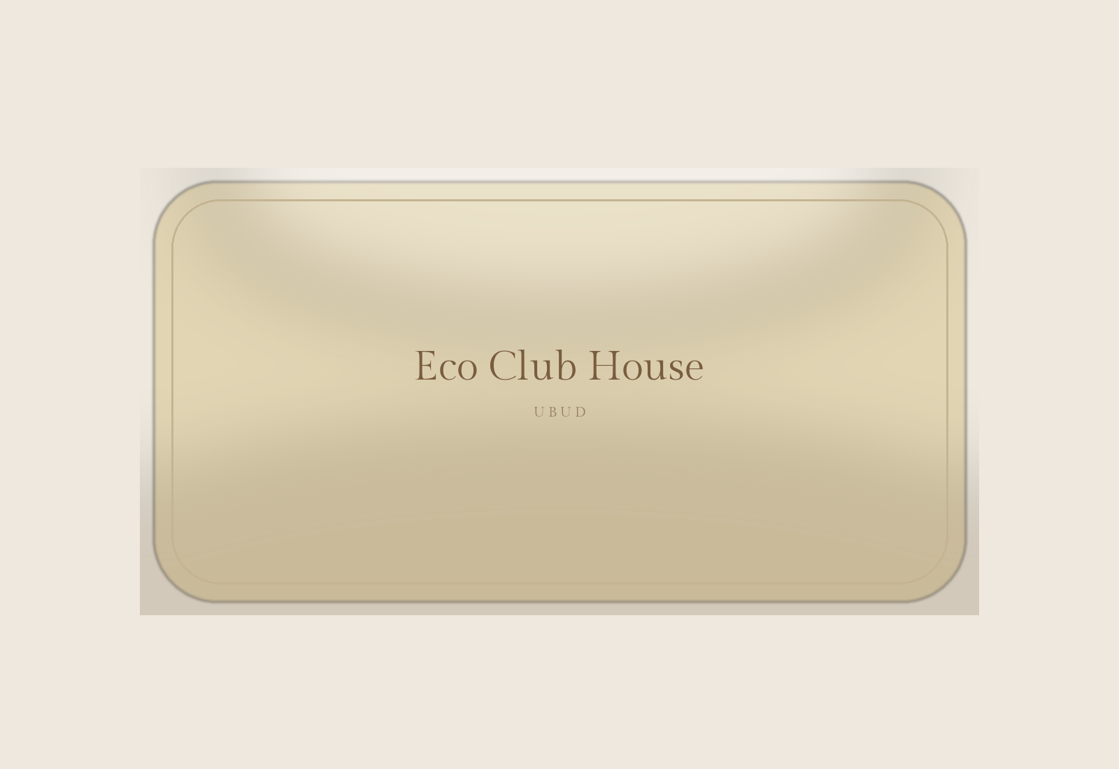
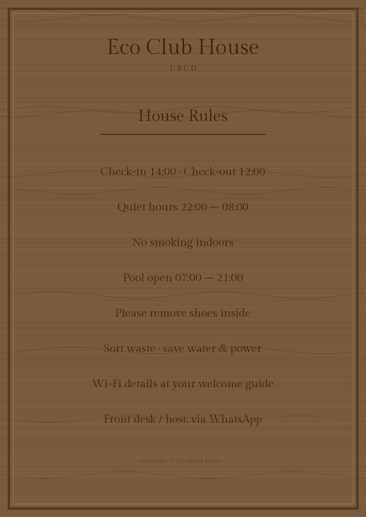
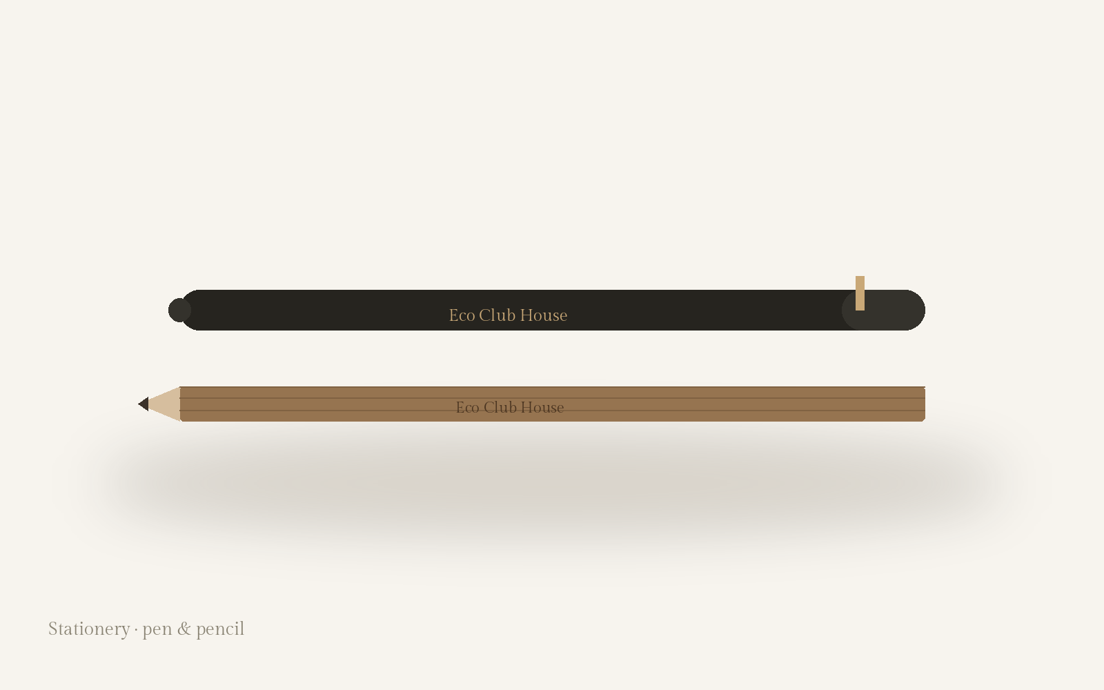
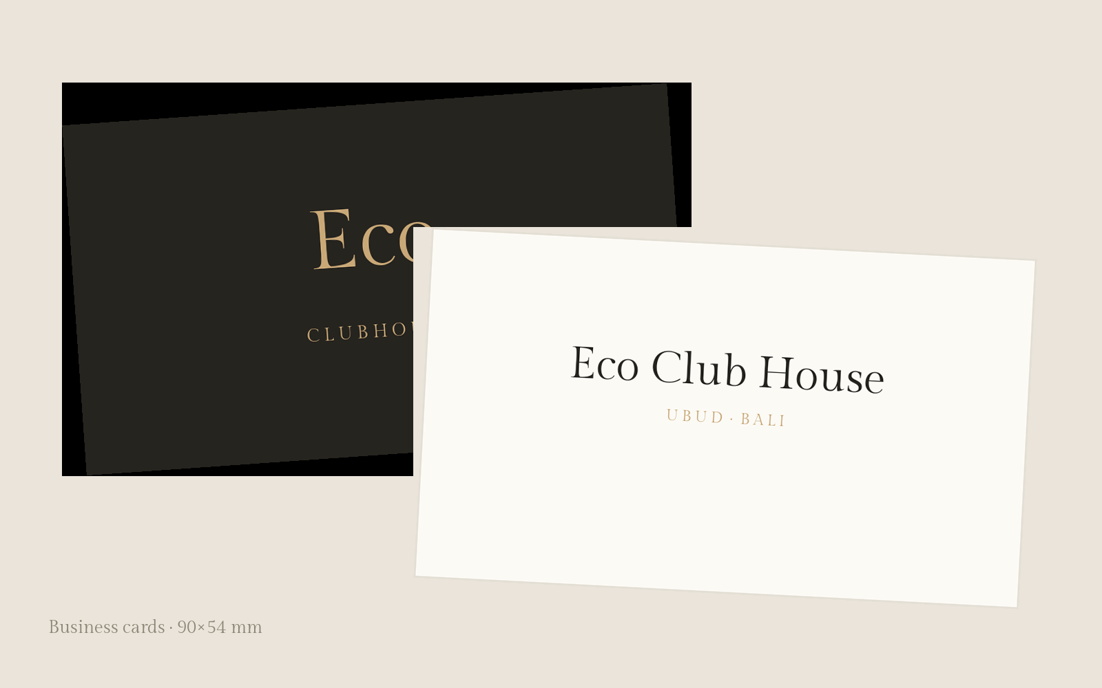
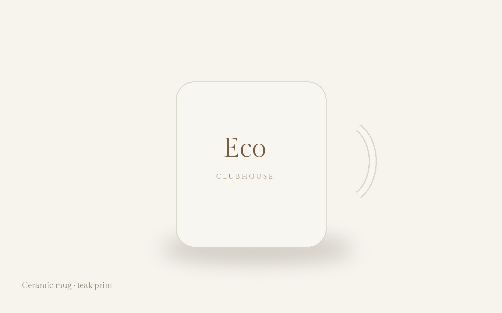
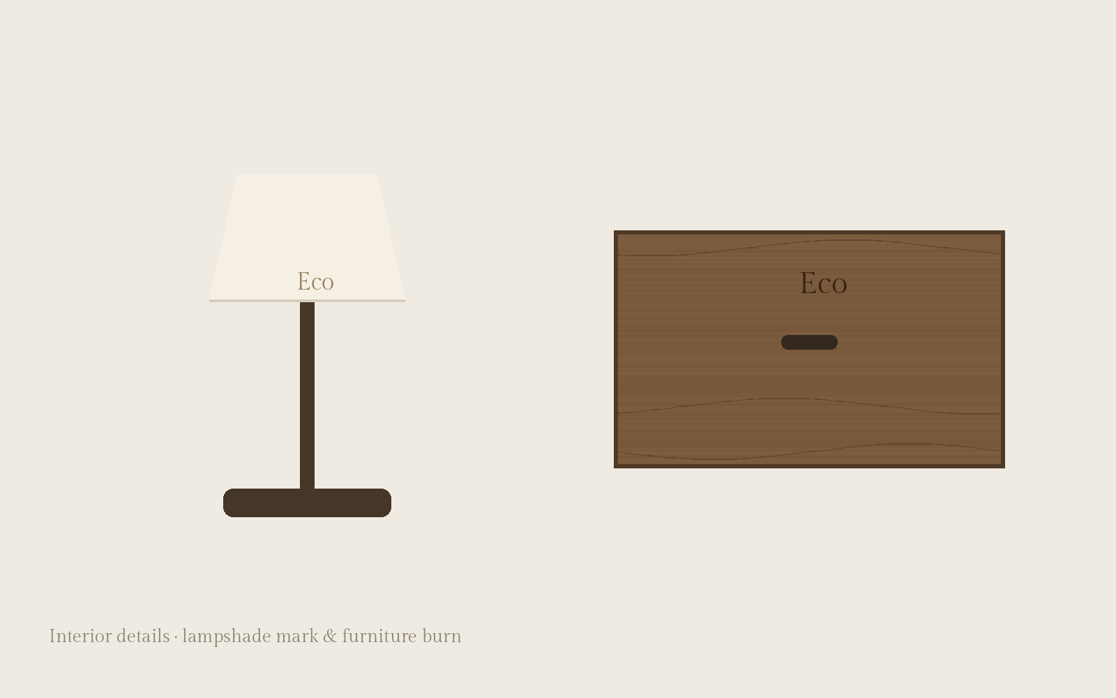
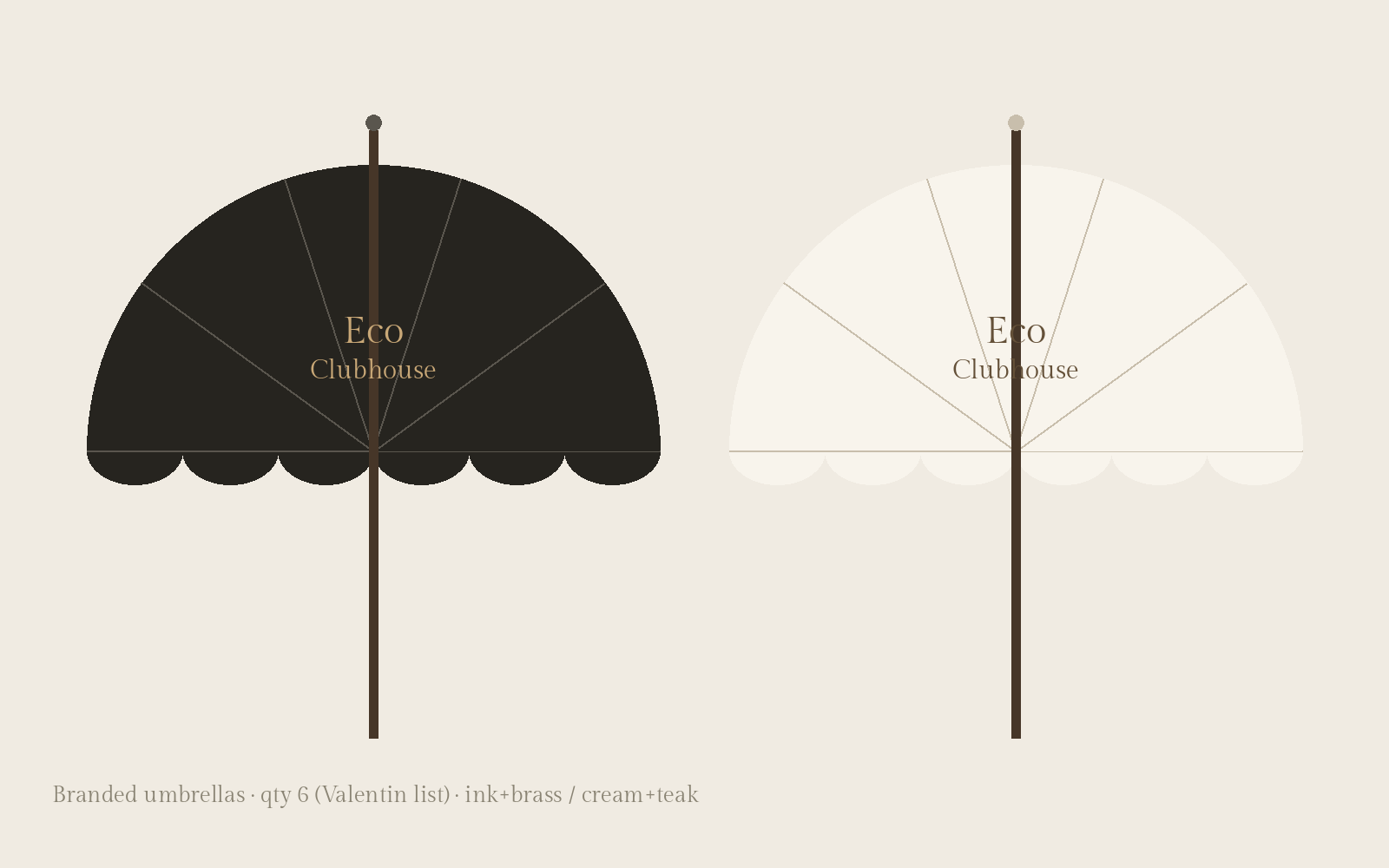
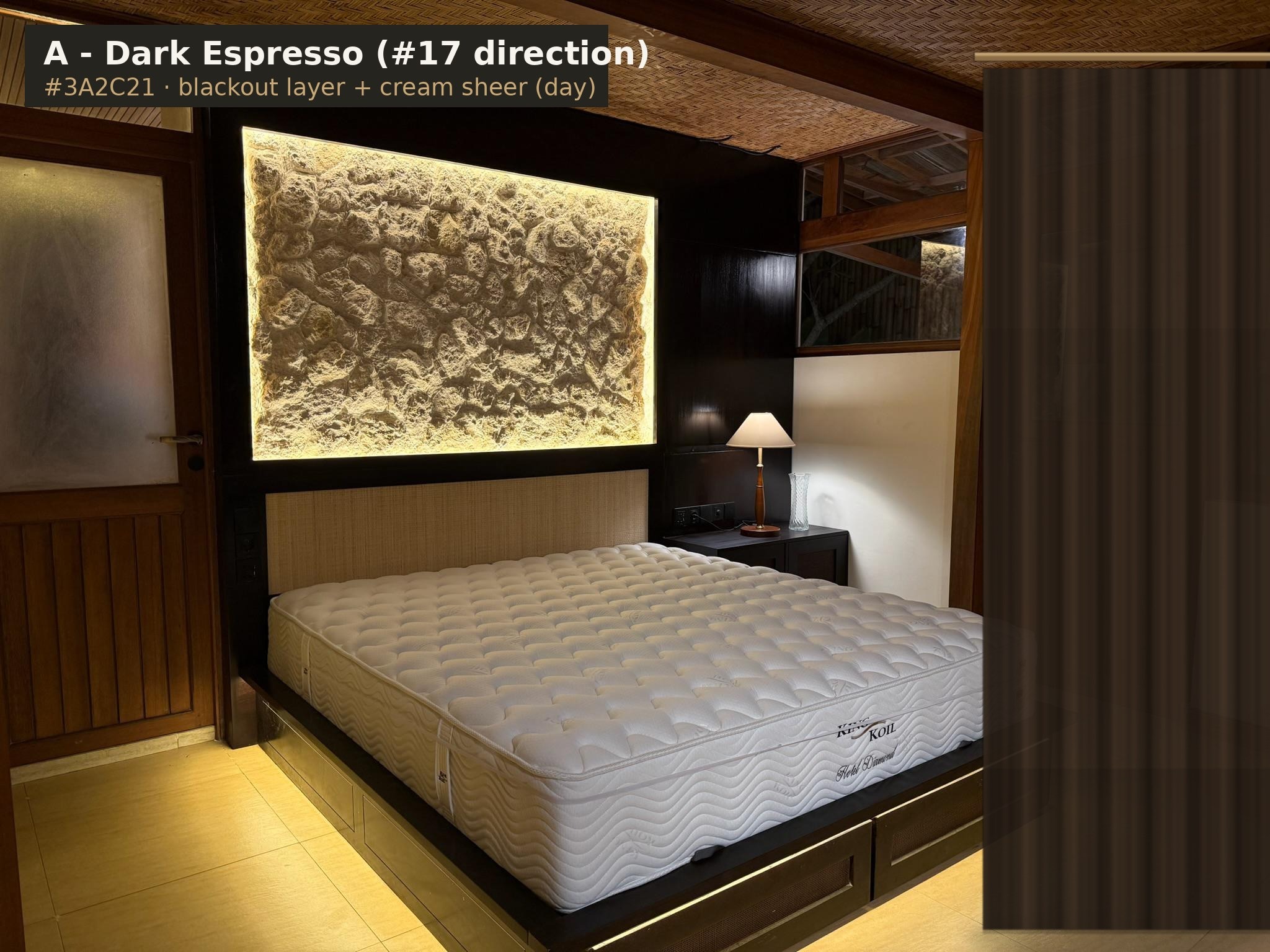
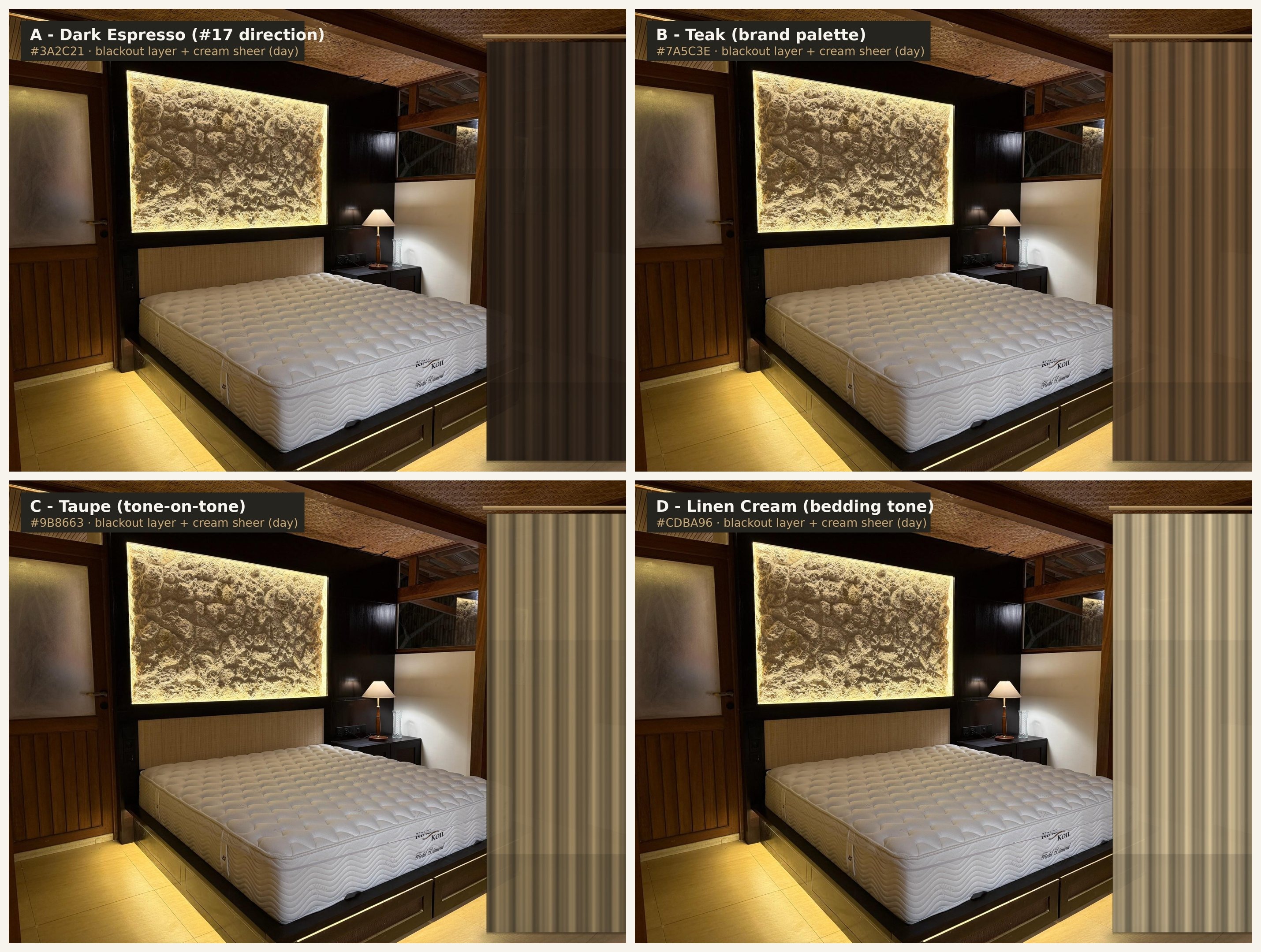
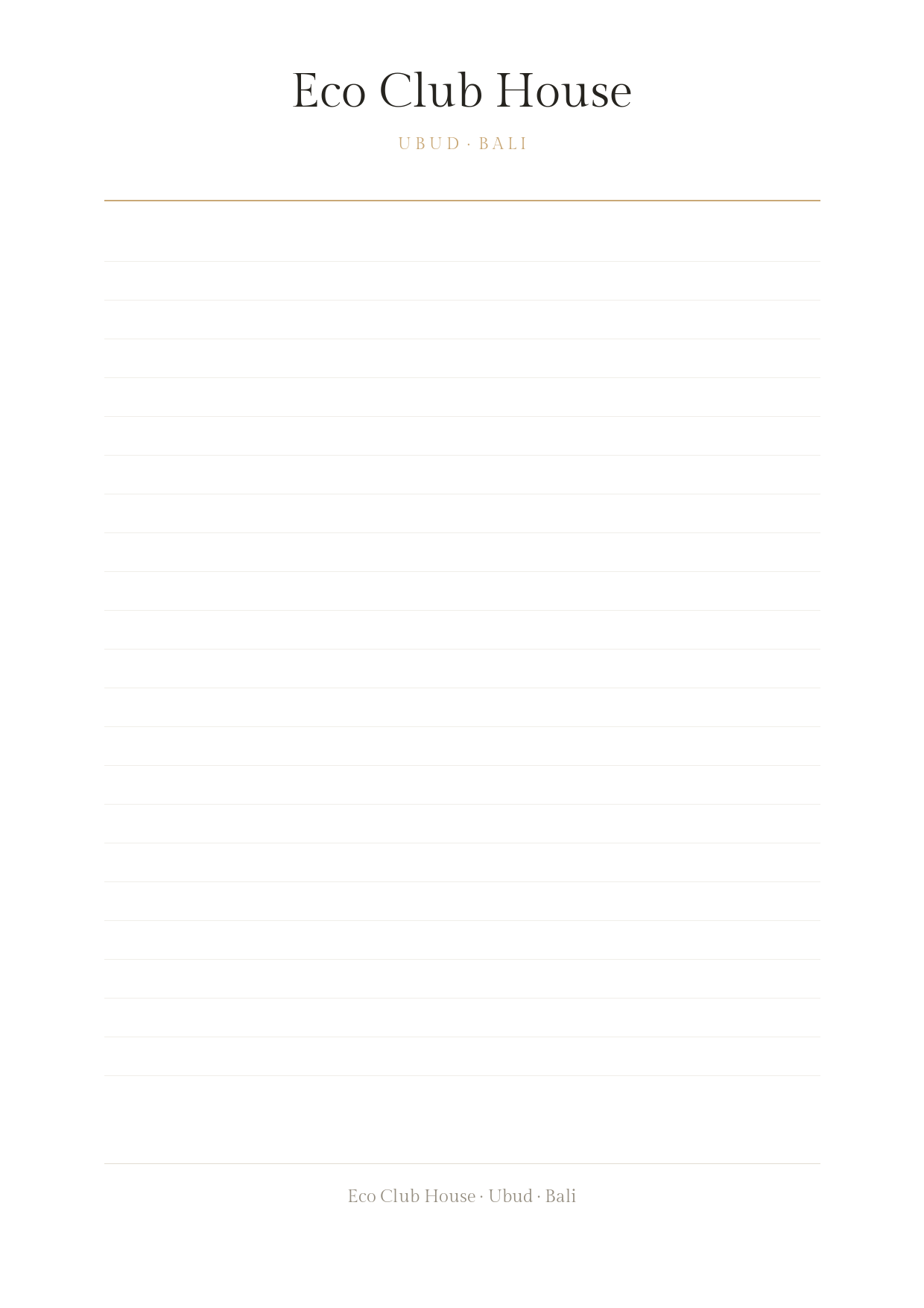
Concept previews on the real house photography. Full-resolution PNG behind every card. Entrance sign spec (ROOT): solid premium wood 60×50×40 cm, logo CNC wood-burned, mounted on a metal post, lit by micro-spotlights.













Wi-Fi Guest Page
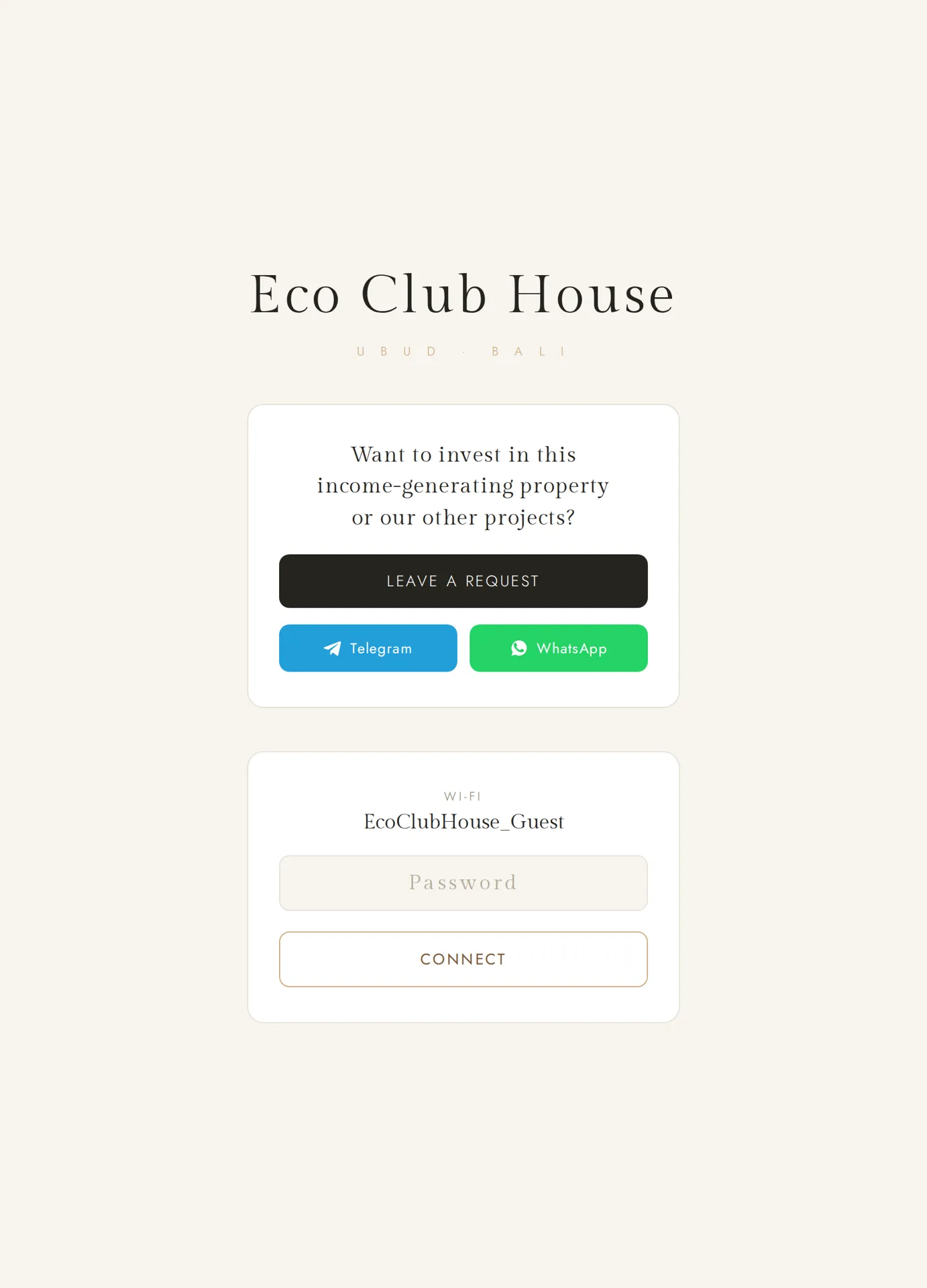
One-screen landing for the QR code in each apartment. Two messages only: invest request + Wi-Fi connect. Password and request-button target are placeholders until launch.
Explored Alternatives
25 typefaces reviewed before the final choice. Kept for the record.